
Top 10 Fonts to Make Your Resume Stand Out
Try Aihirely for
Smarter Interview Prep
Experience real-time AI support tailored to your Resume.
Boost your confidence and ace every question with
AI Mock Interview.

Image Source: pexels
Choosing the best font for resume design is crucial as it can significantly impact its effectiveness. Opting for the best font for resume ensures clarity, professionalism, and readability. Sans-serif fonts are often considered the best font for resume layouts because they minimize visual clutter, making your information stand out. A carefully selected font not only creates a strong first impression but also demonstrates your attention to detail and helps recruiters easily navigate through your accomplishments.
Key Takeaways
-
Pick simple fonts like Calibri or Helvetica for easy reading.
-
Stay away from fancy or tricky fonts. They can distract people.
-
Use a font that fits the job and company style. This shows you understand the role and what they want.
Best Font for Resume: Top 10 Professional Choices

Image Source: pexels
Calibri
Calibri is a modern sans-serif font that has become a favorite for resumes. Its clean lines and rounded shapes create a polished and professional look. This font promotes ample white space, ensuring your resume remains easy to read even when packed with information. Calibri’s design also makes it ideal for digital applications, as it reduces visual clutter and enhances readability on screens. If you want a font that balances professionalism and clarity, Calibri is one of the best font choices for your resume.
Helvetica
Helvetica is a timeless font that exudes simplicity and elegance. Its minimalist design gives your resume a contemporary edge, making it perfect for industries like tech or design. Helvetica’s clean and uniform appearance ensures your content remains the focus, not the font. Recruiters appreciate its readability, especially when reviewing resumes on digital platforms. If you’re aiming for a sleek and modern look, Helvetica is a strong contender.
Garamond
Garamond offers a touch of sophistication with its elegant serifs and old-style proportions. This font is particularly suitable for creative fields, as it conveys warmth and authenticity. Its design enhances readability, making it a great choice for resumes with longer sections of text. Garamond’s historical significance and organic feel make it stand out while maintaining a professional tone.
Arial
Arial is a universally recognized font that combines simplicity with professionalism. Its modern and clean design ensures your resume looks polished and easy to read. Arial is widely used across industries, making it a safe choice for any job application. If you’re unsure which font to choose, Arial’s versatility makes it one of the best fonts for resumes.
Times New Roman
Times New Roman is a classic serif font that has stood the test of time. Its formal appearance conveys authority and credibility, making it ideal for traditional industries like law or academia. However, some recruiters may find it outdated. To avoid this, use Times New Roman sparingly and ensure your resume’s layout feels fresh and modern.
Georgia
Georgia strikes a balance between professionalism and creativity. Its larger x-height enhances legibility, making it a great option for resumes targeting creative industries. Georgia’s warm and approachable design adds a personal touch to your application while maintaining a polished appearance.
Cambria
Cambria is a versatile font that works well across various industries, including finance and academia. Its generous spacing between characters and lines improves readability, especially for information-dense resumes. Cambria also renders beautifully on digital screens, making it a reliable choice for online submissions.
Verdana
Verdana was specifically designed for digital platforms, making it an excellent choice for resumes submitted online. Its spacious characters and ample spacing enhance readability, even on smaller screens. Verdana’s distinctive design ensures clarity, helping recruiters quickly scan your resume.
Tahoma
Tahoma is another sans-serif font that offers clarity and simplicity. Its clean design makes it suitable for resumes in both traditional and modern industries. Tahoma’s straightforward appearance ensures your content remains the focus, helping you make a strong impression.
Lato
Lato combines professionalism with a modern touch. Its sleek lines and contemporary feel give your resume a polished appearance. Lato’s various weights allow you to create clear distinctions between sections, enhancing readability. This font is perfect for modern resumes that need to balance approachability and authority.
How to Choose the Best Font for Resume
Consider Professionalism and Industry Standards
Your font choice should reflect the level of professionalism expected in your industry. For example, a serif font like Times New Roman works well for traditional fields such as law or academia. On the other hand, a modern sans-serif font like Helvetica or Calibri suits creative or tech industries. Research the company and industry to align your font with their standards. A professional font ensures your resume makes a positive first impression.
Prioritize Legibility and Readability
A clear and legible font is essential for an effective resume. Hiring managers often spend only a few seconds scanning resumes, so your font must make your information easy to read.
Legibility is the cornerstone of an effective resume font. A legible font ensures that every letter and word is easily distinguishable, allowing hiring managers to read your resume quickly and without strain. This clarity is crucial, as it ensures that your qualifications and experiences are conveyed clearly, reducing the risk of important details being overlooked.
Choose fonts like Arial or Calibri, which feature clean lines and excellent readability.
-
The most important factor in selecting the best font for your resume is clarity.
-
A clear and legible font ensures that every word on your resume is easily readable.
-
Fonts like Arial and Calibri are popular choices because of their crisp, clean lines which make your text stand out without any strain on the reader’s eyes.
Ensure ATS Compatibility
Many companies use Applicant Tracking Systems (ATS) to filter resumes. To ensure your resume passes through these systems, use standard fonts like Arial, Calibri, or Helvetica. Avoid fancy or decorative fonts, as they may not be recognized by the ATS software. Using an ATS-friendly font ensures your resume reaches the hiring manager without technical issues.
Match the Font to the Job or Company Culture
Your font should reflect the company’s culture and the role you’re applying for. A creative agency might appreciate a modern font like Lato, while a corporate firm may prefer a traditional font like Georgia. Matching your font to the job shows that you’ve tailored your application and understand the company’s values. This attention to detail can set you apart from other candidates.
Ideal Font Sizes for Resume Sections
Font Size for Headings
Your resume headings should immediately grab attention and guide recruiters through your content. To achieve this, use a font size between 14 and 16 points. This range ensures your headings stand out without overwhelming the page. For example, if your body text is 11 points, increasing the heading size to 14 points creates a clear visual hierarchy. Larger headings make it easier for hiring managers to locate key sections like “Experience” or “Education” at a glance. Always ensure consistency in heading sizes throughout your resume to maintain a polished and professional appearance.
Font Size for Subheadings
Subheadings help organize your resume into smaller, digestible sections. Use a font size slightly smaller than your main headings but still larger than the body text. A size between 12 and 14 points works well for subheadings. This approach creates a clear distinction between sections while maintaining readability. For instance, subheadings like “Skills” or “Certifications” should be prominent enough to catch the reader’s eye but not overpower the main headings.
Font Size for Body Text
The body text is the heart of your resume, so readability is crucial. Stick to a font size between 10 and 12 points for the main content. This range ensures your text is easy to read without appearing cramped or too sparse. Avoid going below 10.5 points, as smaller sizes can strain the reader’s eyes. A well-sized body text ensures your accomplishments and qualifications are presented clearly and professionally.
Font Size for Your Name
Your name deserves special emphasis as it’s the first thing recruiters notice. Use a font size between 14 and 16 points to make it stand out. Larger font sizes create a strong visual impact and set the tone for the rest of your resume. Placing your name at the top in a bold, slightly larger font ensures it leaves a lasting impression. This simple adjustment can make your resume more memorable.
Fonts to Avoid on Resumes
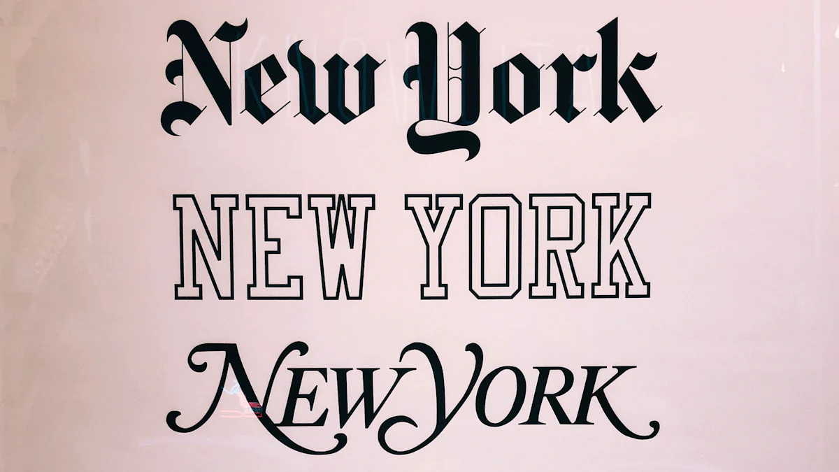
Image Source: unsplash
Overly Decorative Fonts
Using overly decorative fonts on your resume can send the wrong message to recruiters. These fonts often appear unprofessional and may suggest a lack of seriousness about the job search. Fonts like Futura, Courier, Brush Script, Comic Sans, and Papyrus fall into this category. Their intricate designs can make your resume harder to read and distract from the content. Decorative fonts may also lack lowercase options or appear too heavy, which can overwhelm the page. To make a strong impression, stick to clean, professional fonts that enhance readability.
Hard-to-Read Fonts
Hard-to-read fonts can frustrate recruiters and hurt your chances of landing an interview. Ornate or unusual fonts often make it difficult to quickly scan your resume, leading to comprehension challenges. Recruiters may even perceive such fonts as unprofessional. Serif fonts, while elegant, may not perform well with applicant tracking systems (ATS), potentially causing your resume to be overlooked. A clean, simple font ensures your qualifications are easy to read and helps you stand out for the right reasons.
Unprofessional Fonts (e.g., Comic Sans, Brush Script)
Certain fonts, like Comic Sans and Brush Script, are widely regarded as unprofessional for resumes. Comic Sans, with its casual and playful appearance, fails to convey the seriousness and competence expected in a professional setting. Brush Script, on the other hand, looks outdated and overly informal. Using these fonts can create a negative impression, making it harder for you to be taken seriously as a candidate. Opt for fonts that reflect professionalism and align with the expectations of your industry.
Additional Tips for Resume Font and Design
Maintain Consistency in Font Usage
Consistency in font usage is essential for creating a professional and polished resume. When you stick to one or two fonts throughout your document, you:
-
Enhance readability, making it easier for recruiters to scan your information.
-
Create a cohesive and professional appearance that reflects your attention to detail.
-
Demonstrate strong organizational skills, which employers value in candidates.
Avoid switching between multiple fonts, as this can make your resume look cluttered and unorganized. Instead, use font variations like bold or italic to emphasize key details, such as job titles or section headings. This approach ensures your resume remains visually appealing while maintaining a clean and professional layout.
Use Font Pairing Strategically
Strategic font pairing can elevate your resume’s design and help you stand out. Use these tips to pair fonts effectively:
-
Combine different font weights and styles to highlight important sections. For example, bold your name and job titles to draw attention.
-
Maintain consistency across headings, subheadings, and body text to create a polished look.
-
Ensure proper spacing between lines and paragraphs to improve readability and avoid a crowded appearance.
-
Use color sparingly to modernize your resume while keeping it professional.
-
Balance style and readability by carefully selecting fonts that organize information without overwhelming the reader.
For instance, pairing a modern sans-serif font like Lato for headings with a clean serif font like Georgia for body text can create a visually appealing yet professional resume.
Tailor Fonts to the Industry and Company Culture
Your font choice should align with the industry and the company’s culture. Selecting the right font shows you’ve tailored your application and understand the role’s expectations. Here’s a quick guide to help you choose:
| Font | Industry | Description |
|---|---|---|
| Verdana | Customer Service | Highly readable on digital screens, ideal for customer service roles with clear layout. |
| Tahoma | Administrative | Compact and professional, fits more content while maintaining readability. |
| Lato | Human Resources | Balances serious and friendly, suitable for HR roles requiring strong interpersonal skills. |
| Roboto | Digital Marketing | Modern and mobile-friendly, ensuring legibility on screens, crucial for tech-savvy roles. |
| Didot | Fashion Industry | Stylish and elegant, adds sophistication while remaining readable, perfect for creative fields. |
By tailoring your font to the job, you demonstrate your understanding of the company’s values and make a strong impression.
Choosing the best font for resume design can make a lasting impression on recruiters. Fonts like Calibri or Helvetica enhance readability and convey professionalism. Avoid decorative or outdated fonts that distract from your content. A consistent, legible font reflects your attention to detail and ensures your resume stands out in any industry.
FAQ
What is the most professional font for a resume?
Calibri and Helvetica are top choices. Their clean, modern designs ensure readability and professionalism, making them ideal for any industry.
Can I use more than one font on my resume?
Yes, but limit it to two fonts. Use one for headings and another for body text. This creates a polished, organized look without overwhelming the reader.
Should I use bold or italic fonts on my resume?
Use bold for headings or job titles to emphasize key details. Italics can highlight specific achievements or dates. Avoid overusing these styles to maintain a clean layout.
Tip: Always preview your resume before submitting it to ensure the fonts look professional and readable on different devices.